Logo
Premise
# World's No.1 Brand
- Elucidation
- Motive
A good logo is a cornerstone of any brand and shows what a company does and what the brand values.The logo design is all about creating an ideal visual brand mark for a company. As every tiny thing matters in the business, the logo also plays a vital role when your business has competition.
A well-designed logo builds trust, grabs attention and makes a stronger impression of a company.
The strong foundation of your identity separates you from other competitions and grabs attention
of new customers.
Industry - Technology
- Elucidation
- Motive
Taglines or Slogans are something that gives you an add on and a new opportunity to state what your brand is all about. Taglines has the
capability to reach your brand to the world. It is an external way to communicate the essence of your brand.
Taglines are similar to logos which sticks in people's mind easily and turns into an iconic feature of your brand.A great slogan spreads like a wild-fire and it is a powerful tool for your brand recognition. Taglines and slogans create one more way to connect with your customers.
Industry - Apparel
Tagline / Slogan
Premise
# 13th / 100 Rank in Forbes 2020
Typography / Font
Premise
# 6th Valuable Brand in the World
- Elucidation
- Motive
Typography or font in a logo should be creative. It is a brave attempt to convey multiple complicated messages and ideas into its simplest form as possible. Logos which has simple,
clear and strong typography gains
more attraction.
As a budding brand, to establish or create relationships with your audience communication is the key and typography is effective communication tool one can use.
Industry - Beverage
- Elucidation
- Sample
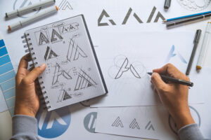
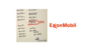
Ideas are greatly stimulated by the process of transformation. Converting things from one form or medium into another can guide thoughts in totally new and exciting directions. One idea leads to another and then you’re set on the ideas trail. Even the most rudimentary sketches are an asset to the logo design process. After working through ideation and concept sketching, you’ll be equipped with a dependable blueprint for refining the logo. This will be a reference layer for digital refinement
Industry - Oil and Gas
Ideation
Premise
# 7th Leading Oil & Gas MNC in World
Detailing

Premise
# 29 / 100 Franchise 500 Rank
- Elucidation
The company’s pink and blue logo depicts a large “BR” that doubles as the number “31”. Carol Austin, VP of marketing for Baskin-Robbins, told CNBC that the logo is meant to convey the fun and energy of the Baskin-Robbins brand as well as the iconic 31 where 31 stands for our belief that our guests should have the opportunity to explore a fun, new ice cream flavor every day of
the month as Austin explained. The logo was introduced in 2005 as part of an entire brand refresh.
Industry - Ice Cream outlet chain
- Elucidation
- Evolution
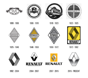
The technological advancements in industries make the culture to evolve overtime. According to the timely changes in fashion and customer
opinions, the need for upgrading your logo is necessary and this leads to evolution.
Industry - Automobile
Evolution

Premise
# Motoring World Awards 2020
Chronological Order
1898 – Founded
1900 – First logo with Initials
1946 – Diamond logo
( yellow colour as brand colour)
1992 – Without name
2007 – Inside Yellow Square
2015 – Present logo (till 2021)
Theme
Premise
# Best Company Culture 2020
- Elucidation
- Motive
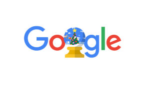
The themed logos are showcased for all occasions which includes big events like Christmas, New year,Valentine's day to simple events like Earth day, Corporate parties, etc.
We can create or transform your existing logo into an eye-catching visual for your unique marketing, annual corporate event or to showcase your events that support a global
cause also to have engaging digital world profile.
Industry - Technology
- Elucidation
The logo consists of the company's name, its values and the mathematical symbol at the top. The main theme of the logo implies that the company is constantly striving for the future, growth and development. Initially the logo type received many criticisms which are vanished completely when it reached success in the market. The term Accenture meant to convey the message as "accent on the future".
Industry - business services
Cost
